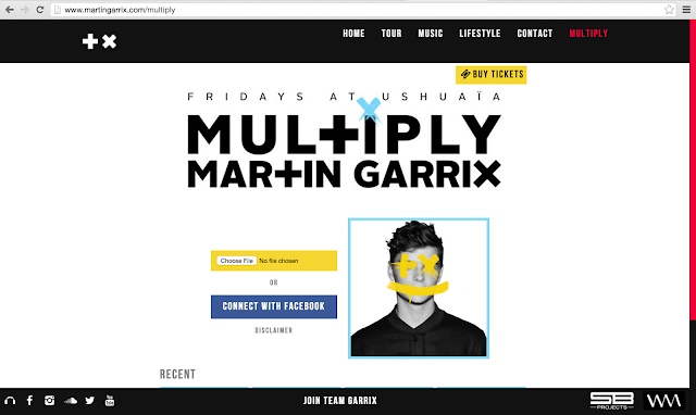
The design for Artist Martin Garrix's web sight is very simplistic and easy to digest for the audience, it contains a simple colour scheme, and is very easy to navigate.
What the Home page has...
Tour Page...
Once again, an easy to navigate page, no unnecessary content, and nothing to extravagant, also a contrast change in colour scheme, from white to black...
MUSIC...
A sample page for his music, one click play, and distinct links to social media. Contrast colour scheme still apparent...
Lifestyle (About)
Up to date information and pictures, keeping up with current affairs with the Paris peace logo, in reference to the recent Paris Terrorist Attacks...
Contact page
An easy to use contact page, with relevant names and all the relevant information. One thing that is apparent about all the links is the lack of a silly context paragraph explaining what the page is about...
The pages are very self explanatory, so they don't require one, which is good.
Multiply (The New Album)
Up to date link to information about the new album, this will change with every new release, a clever use of marketing...


No comments:
Post a Comment